7 Outdated Web Design Trends in 2020
In today’s day and age, web and technology are changing fast. Every year, new web design trends emerge. As such, your site may contain one or more the following outdated web design trends. This leads to a poor first impression and can mean all the difference between visitors taking action on your site, or hitting the back button in their browser and going to your competitor.
In this post, we’ll tell you what’s outdated and what to use instead so you can make sure your website’s design is up to date.
Outdated Web Design Trends To Avoid In 2020
This is what we’ve observed as web design trends that are quickly becoming outdated.
1. Homepage sliders
The first trend we are going to talk about are the homepage sliders. Various statistics show that homepage sliders hurt the user experience more than help convert visitors into customers and clients. They lead to overwhelm and make it harder for visitors to focus on the desired action.
According to a study done at nd.edu, only 1% of visitors clicked an item in the home page carousel (and that was in 2013). Of those 89% of them clicked the item in the first position. And the numbers have been dropping. So basically your carousel items #2-X are not being seen or clicked, which is why there has been a movement in recent years to drop home page carousels.
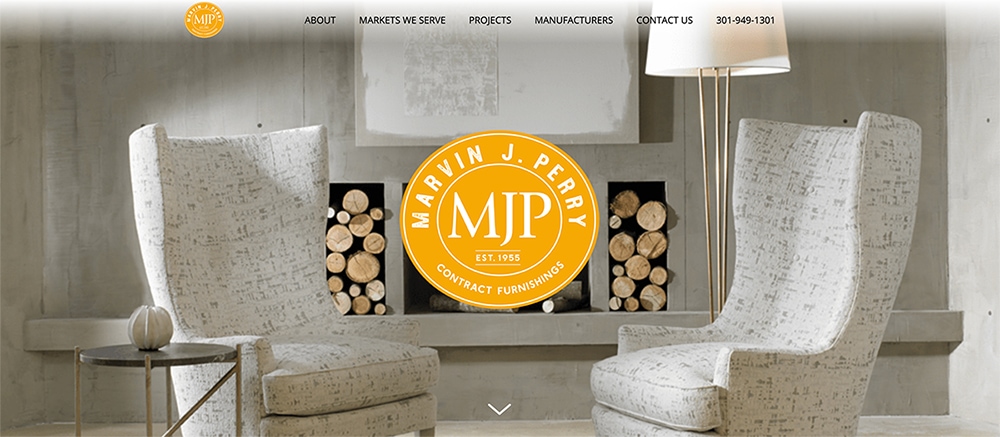
In an era where white space and minimalism are in, you don’t need full height or full width hero sections. Avoid scrolling your announcements and instead use the space thoughtfully. In the above example, Marvin J. Perry draws your focus by using one hero image with concise content.
2. Complex navigation
Simply put, drop-down menus are out. Instead, simple and minimal navigation will make it easier for users to find information on your site and lead them towards the action you want them to take.
This menu bar contains too many sub-menus and requires the visitors to read numerous small links to find what they are looking for.
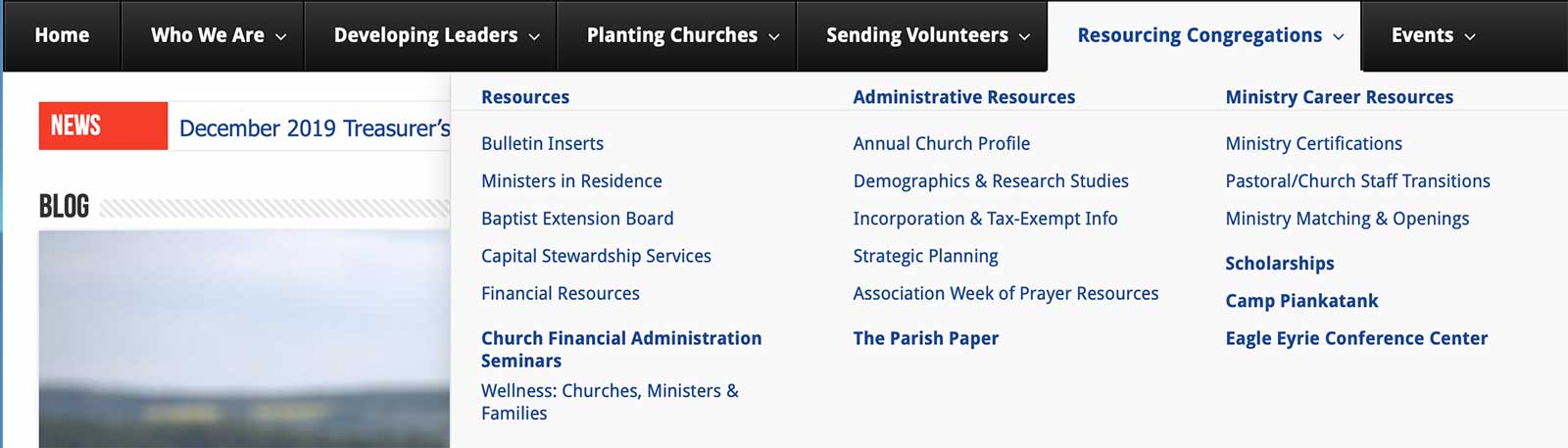
The goal of your navigation is to help users find what they are looking for and this will ultimately lead to more conversions so simplifying your navigation is crucial. Users browsing on desktop computers should not have to hunt for navigation items since they have plenty of screen real estate, make them visible without a hamburger menu.
3. Sidebars
Nowadays, most sites don’t use a vertical sidebar for subpage navigation. Thanks to the overuse of banner ads, most users tend to ignore the sidebar which makes them pretty inefficient and pretty static.
Instead of a sidebar, go with a horizontal navigation and sub-navigation. If you need or want the sidebar, limit its use to your blog page as you can use it to display similar or related posts and lead visitors to different categories.
4. Obvious stock images
Cheesy stock photos and clipart used to grace every website on the Internet but luckily, they went out of fashion a long time ago.
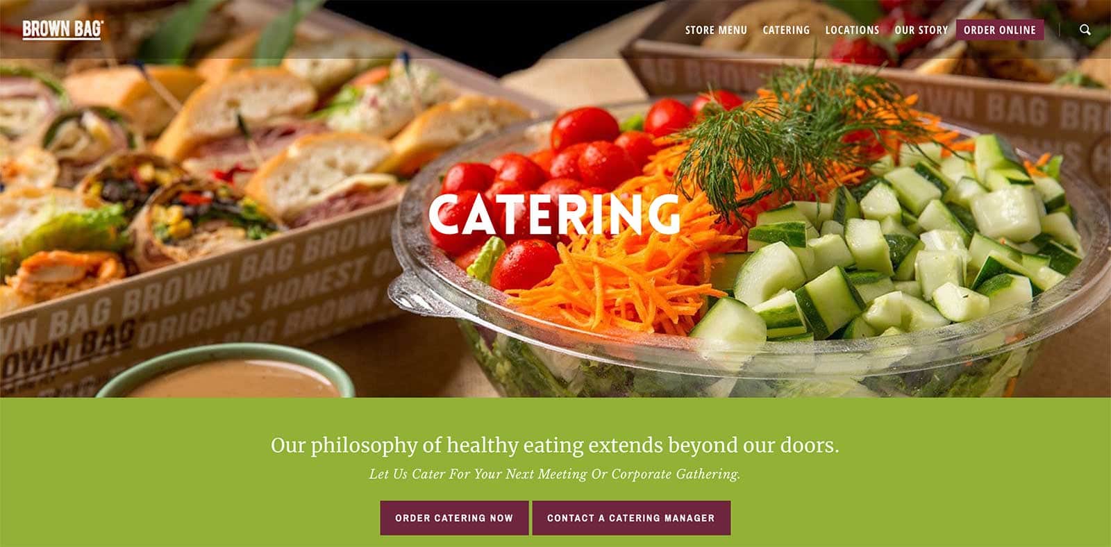
Instead, consider setting up a branded photo shoot. Not only will this help you show the people behind your brand but it will also set you apart from your competitors. Brown Bag uses branded photo shoots to showcase their delicious food and build trust with their audience.
Keep in mind that a professional brand photo shoot is not the only option. You can also use take your own photos with your smartphone and use original images for your products or services.
Alternatively, if you have artistic skills, consider using hand drawn elements as this can be a great way to infuse your personality into your brand and set yourself apart.
5. Overly corporate or professional look
Directly in line with the tip above, remember that people are losing trust in big brand names and want to do business with real people instead of faceless corporations. As such, avoid making your site look overly corporate or professional.
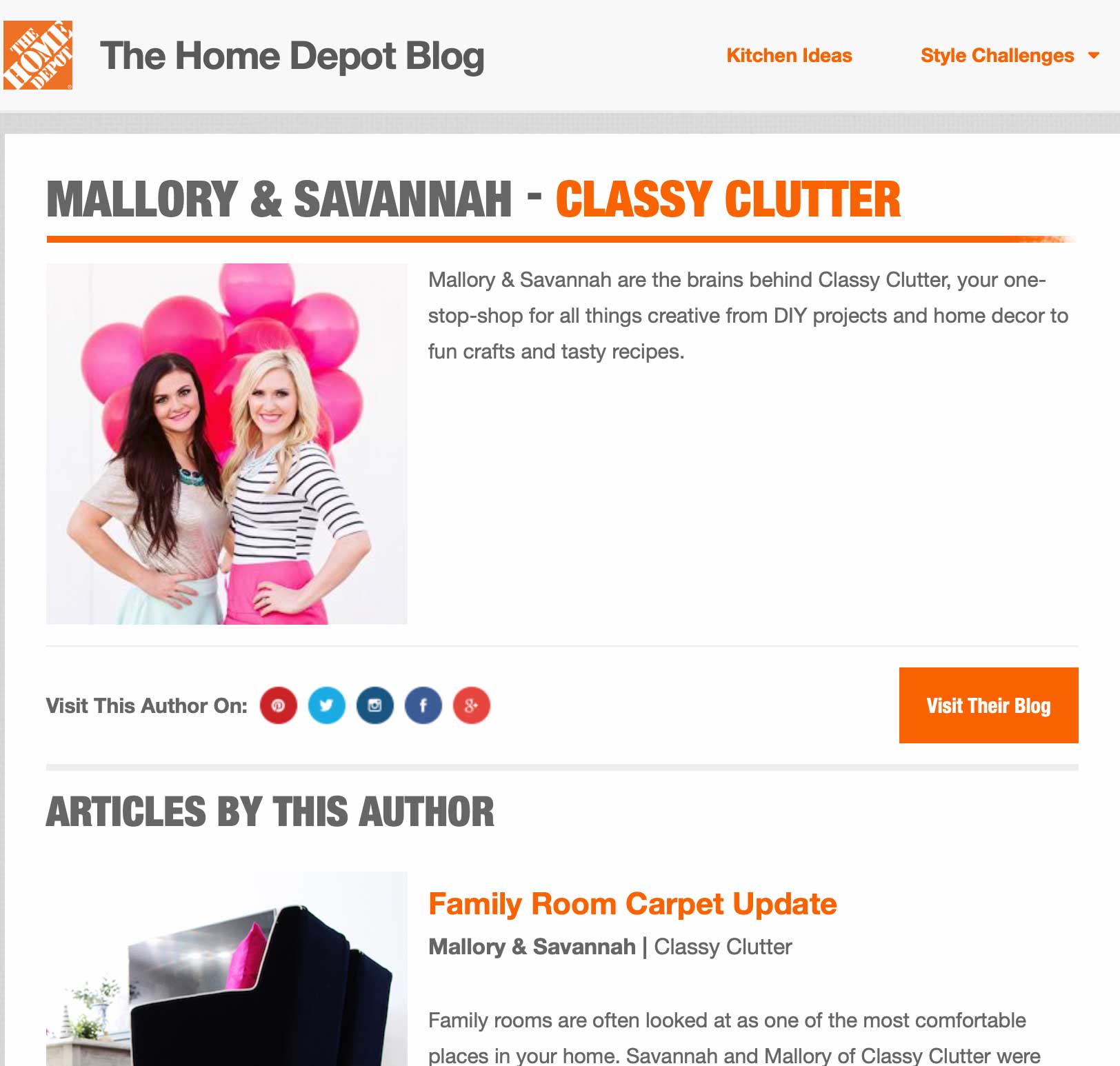
This is the reason why big companies like Home Depot are hiring social influencers like Mallory and Savannah to promote their products.
Make your website more personal with real photos and easy to understand language. Avoid putting your mission statement on your homepage and referring to your business in third person.
Instead, add personal elements that inject emotion and humanity into your website. Don’t strive for perfection as little imperfections can go a long way towards showing your human side.
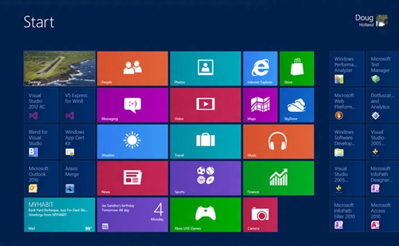
6. Super flat design
Super flat design was all the rage for a while. It was heavily used in web design as well as in graphic and print design. Nowadays, it’s less popular and we’re seeing websites move away from this trend.
When Microsoft released Windows 8 Metro in 2012 it helped fuel the flat design trend that we’ve seen for much of the last decade. The challenge with flat design is that it lowers the emphasis of all of the items to the same level and makes it difficult for anything to stand out and can feel overwhelming. Be sure to use hover or overlay effects to give visitors cues on what can be clicked on.
Instead of flat design, consider layering some soft textures to add more interest to your website pages. Adding shadows behind images is another great way to make your site visually more appealing.
A few other things you can try include using 3D elements, floating buttons, images, and text to create a dynamic look throughout your website.
7. Dull color schemes
Lastly, dull color schemes are out. Those muted, boring corporate colors are no longer in so there is no reason your website should use them.
Instead of opting for muted colors, consider using vibrant colors that are getting more and more popular. A few examples include:
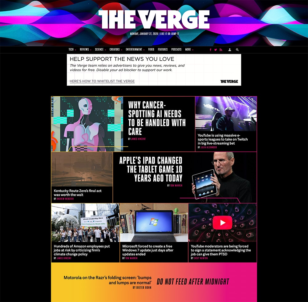
- Duotones where one color is superimposed over another. This technique was made popular by websites like Verge and Spotify.
- Futuristic color schemes are in as well which make websites appear more modern and technologically savvy.
- With the advent of dark mode on both Apple and Windows computers as well as iOS and Android devices, it’s no wonder that the Internet is following in the same footsteps. Dark mode makes other colors pop so if you want to draw attention to certain calls to action, consider having a website with a dark background.
What’s Next?
Using the latest web design trends for your website shows that you care about your brand reputation and image. That’s why you have to keep up with current and emerging design trends so you can avoid having a website that looks outdated.
Have an outdated website? Need a re-design or enhancements to your website? Contact us today for a free quote and see how we can employ the latest web design trends to give your site a fresh new look.
Share this post
We focus on beautiful web design that delivers results for your organization. Our specialty is creating customized WordPress websites.
About Us
Johnny Flash Productions
Johnny Flash Productions is a creative agency based outside of Washington D.C. that focuses on digital strategy, web design and development, graphic design and event production that helps businesses get better results from their marketing.

John has been managing my website SEO and Google Ads for only a few months now and his services have already generated profitable leads. I can’t say enough about his company’s professionalism, promptness and results oriented approach. Hiring his company has been an excellent business decision!!

The Johnny Flash team is incredibly skilled, attentive and patient. We are very happy with our new WordPress website!

John and his team do top quality design work, website work, and just about anything you would need to have a dynamic presentation in both print and digital media. Incredibly talented and innovative, you can call him with a "thought" that comes back to you better than you ever imagined. Truly professional and talented, I could not recommend more highly.

We regularly get rave reviews about our website. Often other non-profits have asked us for a referral. Johnny Flash was easy to work with and has always been responsive to our needs. They provided several built in tools that help keep our website from becoming stale.

I recommend Johnny Flash Productions because they respond promptly and with honesty when requesting their services, they are very professional and I am a satisfied client!
They fulfilled my expectations with the website and branding project. It has already been a success and helped us reach our goals for our business. Thanks Johnny Flash Productions.

Johnny Flash Productions has played an integral role in the growth of our business. From logo redesigns, website design and management, fliers, banners, signs and more, they have done an incredible job of taking our ideas and WOWing us with his visual designs.
John's knowledge base allows them to understand our ideas and concepts and bring it all together in a professional, well thought out deliverable. Their work has always exceeded our expectations in both quality and speed.
We look forward to continuing our long business relationship as he continues to stay on top and ahead of visual marketing trends without losing it’s classic appeal.

We found Johnny Flash Productions to be professional and a pleasure to work with. Their industry knowledge and creative approaches were incredibly helpful.
Our new website exceeds our expectations and we look forward to continuing our relationship with Johnny Flash Productions with their responsive and ongoing website upkeep, maintenance and SEO.

Exceeded all expectations in their abilities to professionally evaluate and customize our company WordPress website. Above all else, their customer service is the best I've dealt with in a long time with any company I've worked with in the past. I definitely recommend Johnny Flash Productions to anyone looking for exceptional service, professional detail and customer support.

We are truly grateful for our time working with John and his team. They were able to manage a full redesign within a relatively tight timeline and delivered an impressive site that also worked well through mobile devices as well.
They kept us on schedule as well and were a pleasure to work with. The team continues to be incredibly responsive following the initial launch.

I cannot begin to speak highly enough of Johnny Flash Productions. I was first alerted to their company by doing a Google search & found only one company around with so many 5-star reviews, so was curious if they could all be real. I found through working with John & Eowyn & the Johnny Flash team that we were able to collaborate to create the perfect website for our organization.

Johnny Flash Productions is a company that truly cares about their clients, this is obvious by not only their work ethic but they also the way they put their heart into every project they complete.
Johnny Flash Productions was a pleasure to work with, we look forward to working with them again in the future.

I would like to thank Johnny Flash Productions for there great service my company has been able to get to get to the top of Google searches in half the time most companies take. I am now receiving 3 to 5 viable leads a day that all lead to service work for my company. And I can not thank them enough for all of there support with my site and maintaining it for me.

John Falke and Johnny Flash were incredible to work with and produced a very professional and progressive website for Covenant Park Consulting and were completely responsive to our vision and goals.

Johnny Flash Productions and their team were aces to work with. Their process was simple, and project schedule was on target.
More importantly, their Storybrand mindset opened us up to a whole new world for our website presence, business development and even our own client communication.

Such an amazing service. A beautiful website that has already gotten the practice new business. John kept us on track so that our website was up and running in the time allotted. Thanks so much. Highly recommend.
John and his team are great to work with. We have worked with them on a broad range of projects including logo development, campaign materials and website design. They are a great partner!

John, Joli and Team provided the path forward for us on how to take our desire to have a brand new website to getting it launched and live. We started at a high level of who we were and what we wanted to accomplish with our website.
John provided an up front schedule of what tasks would be completed by when from their team.
There were tweaks along the way that we would make and feedback given, and it was always well received with the changes being made in a timely manner. Thanks John and Joli.

We chose Johnny Flash Productions because I knew the person, John Falke. Relationships are important. Knowing character is important and relevant to business decisions. Knowing whether a person/business will stick by their word is important along with can they perform.
A company that can perform is good, but if they do not stick by their word, skill means nothing. You produced a great product, worked with us, gave a fair price and kept us on task.

Johnny Flash redesigned both our church website and our preschool website to align with our new branding, helped us switch web hosts and met some tight timelines as well. John and his team are always professional, have fresh ideas and are quick to respond to questions.
They also worked us to revamp both websites within our set budget while still providing a quality web design and custom look. If I could give them ten stars, I would!

Professional, knowledgeable, friendly! Everything you could ask for in a website development firm/SEO company. Johnny Flash Productions is the best website development firm and SEO firm in Northern Virginia!

Efficient, effective and professional - Johnny Flash Productions did an awesome job of rebranding and migrating our WordPress website. We launched last week and there is positive feedback all around for the sleek, new, mobile friendly look.

We have been very pleased with our website design experience with Johnny Flash. We appreciated how their structured process enabled our website team to prioritize our goals for the project and develop a final product customized to meet our individual needs.

Johnny Flash did a great job on our new Wellesley Hills Congregational Church website. Delivered on time and on budget. They helped us shape good content as well.
We were so satisfied we had them redo our Wellesley Nursery School in the Hills website also.

We were so grateful to have found Johnny Flash Productions to help us with our marketing needs. Their work was above and beyond what we expected. The staff are very competent and great to work with. Excellent results!

Was a pleasure to work with Johnny Flash Productions to walk through the full life cycle of a complete redesign of several of our ministries websites. Working with people who are experts caused us to think outside the box in how we really tell our story through our website.
The entire team was great to work with and the value has been incredible! God is good!

Johnny Flash Productions was a joy to work with! They helped our church completely re-do our website. They also helped us refresh our look and logo. We have had many people comment on how much they love our new website and how much easier it is to navigate.

It has been such a pleasure working with John and Nicole to develop our WordPress website. The team is very professional and worked closely with us during the entire process. We couldn't be happier with the result, we love our new website.
I definitely recommend Johnny Flash Productions!

We had a great experience working with Joli and the team at Johnny Flash. Their whole process was very helpful to shaping and sharing our website message.

We've worked with John and his team for several years on multiple projects. They deliver great work on time, on budget and with solid ongoing support. We highly recommend Johnny Flash Productions!

When we all get a little too busy, sometimes we forget to say a heartfelt "Thank You"! I am so grateful that God led us to partner with you. I know good things will come from our hard work done together in His name. The website is terrific. Pure and simple.
Thanks for your expertise, guidance and always friendly attitude.

John and his team at Johnny Flash Productions did an amazing job on our new company website! John was very patient and professional throughout the entire process and always responsive to any request we had.
I would definitely recommend their services to anyone looking to create a website!

Working with John and his team has been such a wonderful experience! They consistently go above and beyond to quickly complete our requests, and it's great working with a team of true experts.
I highly recommend them for anyone looking for WordPress developers.

Excellent WordPress Web Designer, we are so lucky to have them design our website we were very satisfied with the results!

We have a fabulous website thanks to their excellent process.

I must admit that I was not crazy about revamping our website, primarily due to the time commitment and cost. However, in looking through the updated content this morning, the new website looks terrific and was well worth the time and expense.
Thanks to you and your team for all of your hard work.

Johnny Flash Productions helped breathe new life into Immanuel’s online presence with their wonderful redesign of our website. Aside from their consummate professionalism, flexibility and keen attention to detail, they were an absolute pleasure to work with.
It had to be a daunting task to be presented with the enormous number of expectations , hopes and ideas generated from our church’s website committee throughout the course of the website re-design, but if anything, Johnny Flash's resulting work exceeded all expectations.
I’m sure I can speak for all of us on the committee when saying that we’d heartily recommend Johnny Flash to any church or organization in need of a skilled, knowledgeable, easy-to-work with design company.

We used Johnny Flash Productions to help us recreate our website and to make it more visually appealing and more current. Working with them was very pleasant and easy. They really listened to what we were looking for and worked within that framework.
I would highly recommend them. I am happy to provide a reference or answer any questions that you may have.

They did excellent design work, were professional and responsive. They were an absolute pleasure to work with, and I plan on using them for future projects.

The experience of building home remodeling company’s website was nothing short of excellent! John and his team are extremely professional, responsive, and efficient at what they do. Their process is clear and they stick to it every step of the way. The weekly production meetings were very helpful and kept the project moving forward at record speed!
My favorite part about working with Johny Flash Productions is that John and his team truly care about their work and they were unwilling to settle on anything less than perfect. We have already had a significant influx of home remodeling leads and they are far more qualified! We highly recommend Johny Flash Productions!

Johnny Flash and team approached the project with as much passion as we had (we're a very passionate team) for the site and logo refresh. We worked through the logo and website designs and within a couple of weeks, it felt as if we were all one company.
The team was super responsive, understood our vision for the logo/website and communicated clearly every step of the way.

This process was so much easier than I expected. John listened carefully to what I was expecting to accomplish with our website and kept me focused on our objectives.
We are now able to register preschool students online (especially important during COVID). Parents are very happy that now they have the option to pay by credit card. I would highly recommend this company!

Johnny Flash Productions gets results building stand-out websites that are optimized for success! Their team of professionals worked quickly to get to know my business and developed a plan of action. Their designers developed an amazing design that exceeded our expectations. If your organization or business is looking to build or improve your presence online.
I highly recommend Johnny Flash Productions!

I was looking for a web designer who was not only talented, but could deliver - and keep delivering what I needed month after month. The team at Johnny Flash Productions brought ideas to the table that complemented what I wanted to do with my website and their design exceeded my expectations.
I was willing to pay more for their continuing monthly service than I had paid previously because they laid out what I could expect from their team. So far, they have under promised and over delivered.

Our organization couldn't be happier with the beautiful website Johnny Flash Productions created for us. They helped streamline thousands of components from our previous site into a site that portrays the mission of our organization and tells the story of our purpose while bringing in and engaging new and returning visitors.
We wouldn't hesitate to use them again and have already recommended them to several people who have seen the quality of our new site.
We have also seen a remarkable uptick in response in those who have gone to the site just in the first few weeks since launch in signing up for future communications. That is the sort of prolonged engagement we have been looking for, and Johnny Flash Productions delivered beyond our hopes.

I have worked with Johnny Flash Productions on 3 of my own websites and recommended Johnny Flash productions to two other family members who were also in need of new websites. We have all had an exceptional experience during the process.
The staff are very responsive, organized, on time and they follow through until the work is complete. We valued them so much that we use them for our monthly maintenance and they help with our advertising online.